Mental well-being and analytics aren't talked about together very often, unless we're talking about data on mental health from some population. That's not what we'll be talking about here. Instead I'm going to describe how a couple of data visualization techniques can help frame challenges in mental wellness, from anxiety to satisfaction with life, and give us helpful tools for tackling them.
The first analogy comes from a simple graph plotted a 2 dimensional axis:
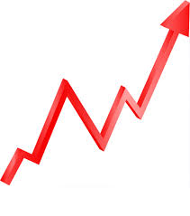
This graph is most commonly meant to represent some value, indicated by height / position on the y-axis, over time, indicated by position on the x-axis. In the analogy I'll describe here, the x-axis represents time, while the y-axis represents some abstraction of a current aggregate of health, wealth, social standing, and any other factors we might consider a contributing factor towards mental well-being.
It's been noted about human nature that money or poessessions alone doesn't bring sustained happiness, and it's common to hear stories about people who are powerful and wealthy but unhappy, while also hearing stories about people with less to their name being happier. While this isn't true always (or even much of the time), the point to draw from this is that static level of status / achievement / wealth / etc. is not sufficient on its own to ensure someone will be satisfied. Bringing it back to our analogy - our height on the y-axis at any given time is not sufficient to guarantee happiness.
What instead seems to be more indicative of happiness or satisfaction at a given time is whether - right now - the y value is moving up or down. In nerdier words, if the derivative is positive at a point in time, we're feeling good, and if it's negative, we're feeling bad. A greater magnitude in either direction amplifies the good- or bad-ness of the feeling.
This should make intuitive sense - if our station in life is rising, we're likely to feel more fulfilled. If it's falling, that's cause for concern. This explains why someone who's just getting out of prison after a lengthy sentence would feel happier in that moment than a billionaire executive who's just been ousted from their company. However high on the y-axis of our graph we currently are, human nature is such that we tend to take how far we've come & how much we've already gained for granted. Whatever level we're at quickly becomes the status quo from which to either fall or climb further, rather than a foundation for sustained happiness.
To put provide a visual example - someone at the position indicated by the star here:
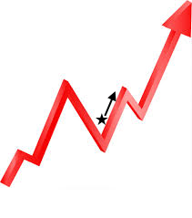
would be more satisfied than someone in this position:
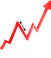
despite the absolute height of the former being lower than the latter. The reason for this is all to do with the direction their height is taking in the graph.
This is obviously a very reductive and not comprehensive way to understand mental well-being. But it's one perspective & lens through which to understand the ebbs and flows of our inner happiness levels.
With this understanding in mind, let's consider one of the most common techniques for feeling more fulfilled and satisfied - performing regular gratitudes. In other words, taking time to think about what you have to be thankful for. What this ends up doing is reminding us of how far up the y-axis of our graph we are & how far we've come. This helps us relive the fulfillment of that climb and helps prevent taking what we already have for granted.
One thing that I've found effective is a complement to this technique - thinking about the things, people, experiences, etc. that I have to be thankful for, and then one at a time imagining myself losing those things. The point isn't to feel the despair of losing everything, but instead to consider - step by step - what it would be like losing the things I have, and to convince myself each step of the way that everything would still be ok on some level. Or if not ok, at least that life is still a fantastic gift & something worth living. When you go all the way down and come out the other end - when you take yourself all the way to a height of zero on your graph - it really highlights all that there is to be grateful for, and reminds you that there's so much potential in always being able to climb up the graph somehow.
The next analogy comes from another type of visualization - a treemap.

This visualization is great at picturing relative portions of a whole taken up by different categories of that whole (it's apparently better at conveying this information accurately than a pie chart). Each sub-rectangle of the whole rectangle represents a subset of the whole being represented, with bigger subsets being represented by proportionally bigger sub-rectangles.
For our analogy, the whole rectangle represents what all you spend your time focusing your brain on in a day. This will include everything from what you've got going on at work, what you're going to have for dinner, to hopes & dreams and anxieties & fears.
In times of anxiety, you'll find that those thoughts that bring you discomfort, fear, and other negative feelings tend to take up a larger portion of the overall whole - they become bigger regions in the treemap of your mind. It's more difficult to be able to enjoy the things going well in life, when the negative thoughts are hogging all the attention. If you've got a happy relationship with friends & a fulfilling career, this may be hard to appreciate in the midst of romantic rejection or a sick family member. Or it might be tougher to enjoy a fun recreational activity if you've just gotten a rejection from a promising job opportunity.
The trick here is to visualize your mental treemap, take inventory of what's there and how much space each sub-rectangle is taking up, and then do what you can to explicitly change the size of them.
What does this mean & how is it done? As touched on earlier - we have a tendency to take for granted things that we already have & things that are going well. If we have a healthy & happy family life, that has the tendency to occupy a smaller rectangle in our treemap, while something we're worried about is going to vie for a bigger piece of the overall pie.
The exercise is to shine a direct light on those things in smaller sub-rectangles - give them more attention than they've been getting. Roll them around in your mind, ask and answer questions about them, give them the appreciation & gratitude that they've been missing. If there's a person associated with them, pick up the phone and give them a call.
To put a visual to it, if you have a treemap that looks like this:
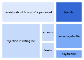
do what you can to make it more like this:
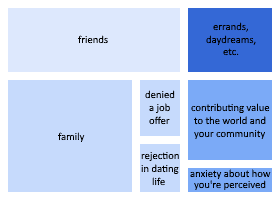
And when that's done, see if you can't sustain the version of the treemap you've just built. If a more healthy makeup can become the default, you'll be in a better state of mental well-being.
One note on this rearranged treemap is the insertion of the item "contributing value to the world and your community". When everything internal may be going wrong, giving back to others / the world / charity / etc. is a reliable source of fulfillment. If you find yourself looking for a positive topic to spend your mental energy on - if not enough good things are already going on to take up most of your mental treemap - doing charitable work, looking for opportunities to give back, or caring for others are all great ways to inject some fulfillment into your mental life.
And there we have it! Those are just a couple of analogies for mental wellness hacks from analytics & data visualization. Next time you find yourself feeling less satisfied or happy than you feel you should be given your situation, or the next time you feel thoughts of worrying & anxiousness things edging out your happpier thoughts, think of graphs! Go through the exercises to put things in context. Your might just put your mind at ease.
